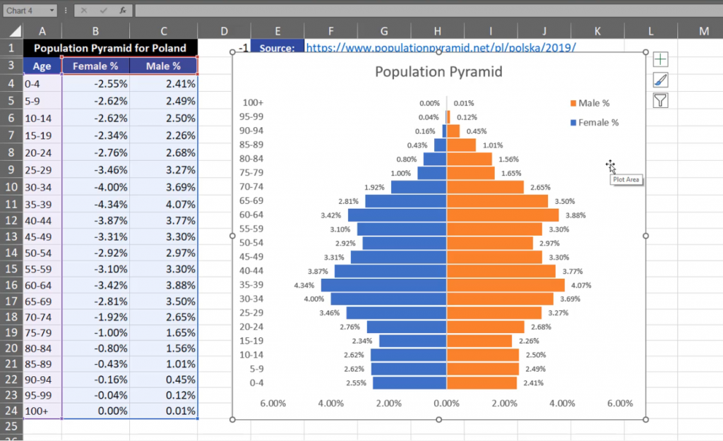
Sometimes, we need to insert a population pyramid in Excel or a chart comparing two values.
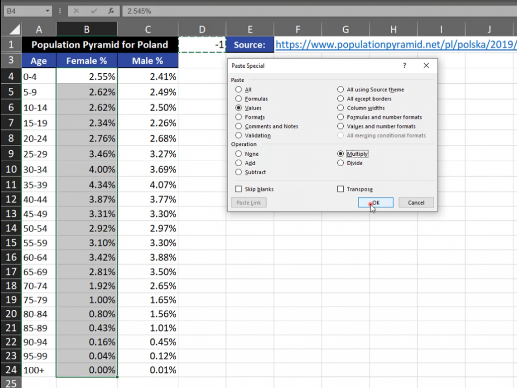
One part of the chart is on the left, while the other is on the right. In order to create something like population pyramid we have to insert a proper chart. I’m using data from Poland as I’m an Excel lover from Poland. We have to have one part of negative values, which will go to the left side of the chart. If you want to do it, you have to write ‑1 in one cell, then copy it and select all values where we want to change the sign, then use the Paste Special option (or use the Alt + Ctrl + V shortcut). In the Paste Special window, select the Values radio button and the Multiply radio button in the Operation section. It means that we will be multiplying ‑1 by the selected values (Fig. 1)
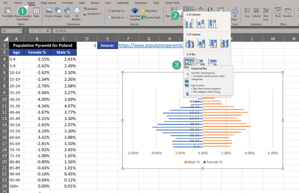
Now, we have negatives and positives, which is the left and the right side of our chart. We can insert the chart. Let’s select one cell and go to the Insert tab and find the Clustered Bar option (Fig. 2)
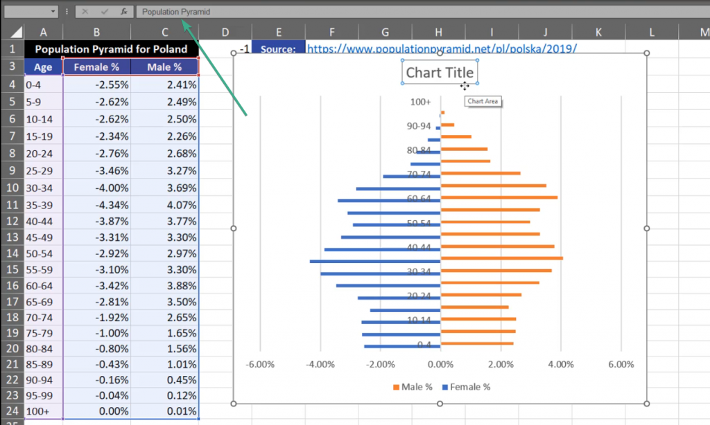
The chart that appeared isn’t good enough for us. The first modification we want to implement is changing the title. Let’s write ‘Population Pyramid’ (Fig. 3)
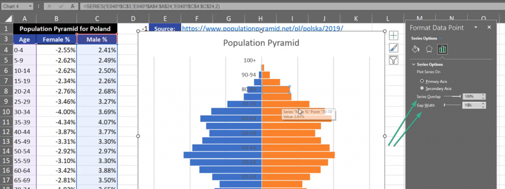
I also want to modify bars. Let’s click on them, then press Ctrl +1. Format Data Series window will appear where we have to select 100% in the Series Overlap section and set the Gap Width to 10% (Fig. 4)
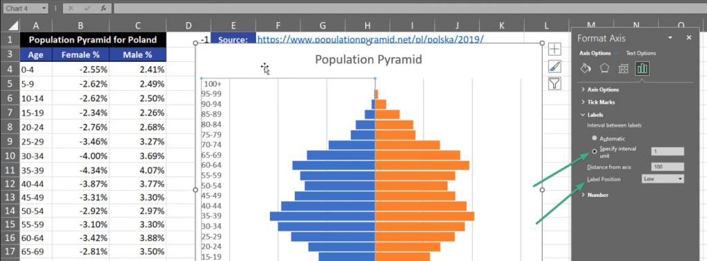
Now, the bars are larger. The next thing is the Vertical Axis. Click Ctrl + 1 shortcut and go to the Labels tab. Set the Label Position to Low which, in our case, is the left side. In the Specify interval unit let’s leave 1 (Fig. 5)
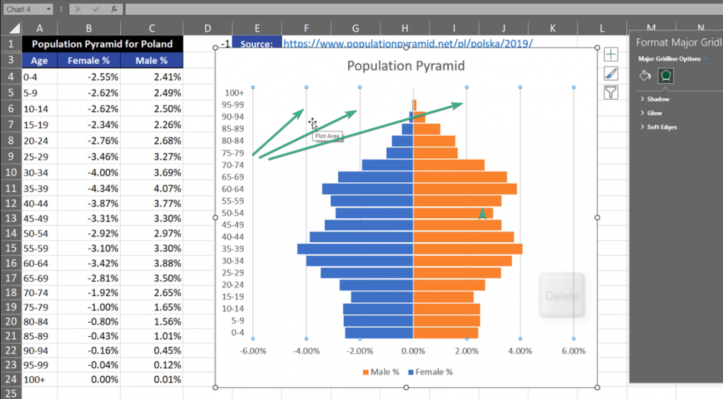
Now, the chart looks much better, but I don’t like the vertical lines here. Let’s click it and press the Delete key (Fig. 6)
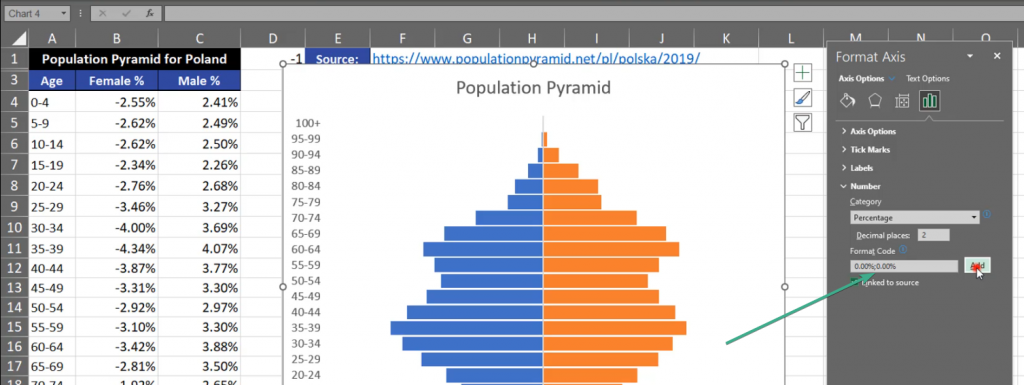
The next thing we want to change is the horizontal axis where we have person values. It means that we don’t need any negative values. We have to select it, press Ctrl + 1, then in the Format Axis window, we need to go to the Numbers bar. In the Format Code bar, we need to repeat the percent code for the negative values. Let’s add a semicolon, then write 0.00% without any minus sign. Then, we click on the Add button (Fig. 7)
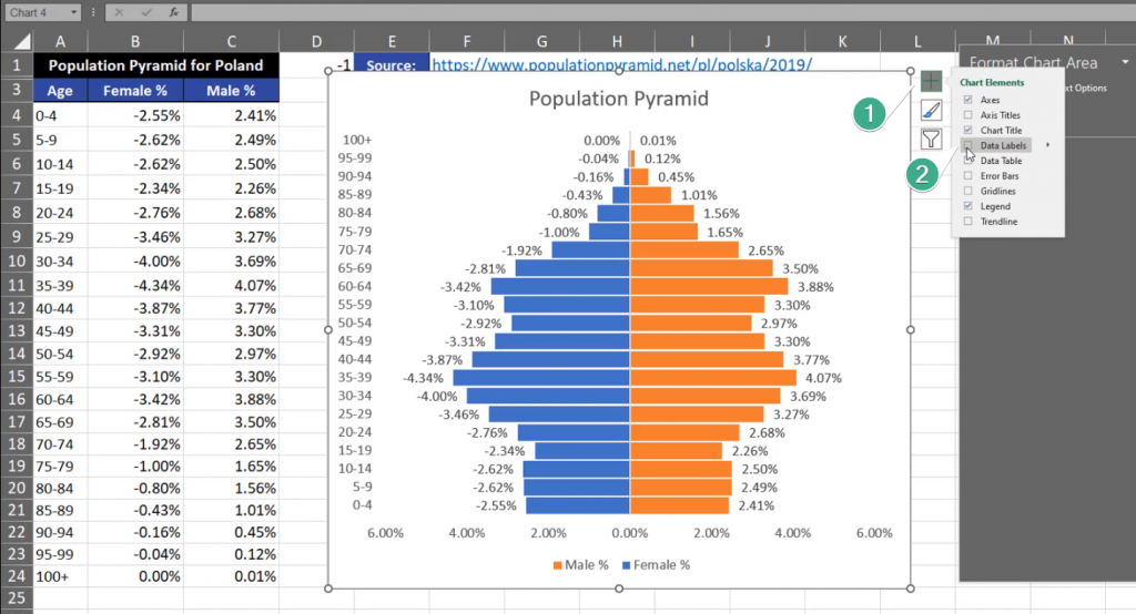
Now, we have positive values on the left and on the right side of the chart. What I’m still missing is Data Labels. We have to press the plus sign and select the Data Labels checkbox (Fig. 8)
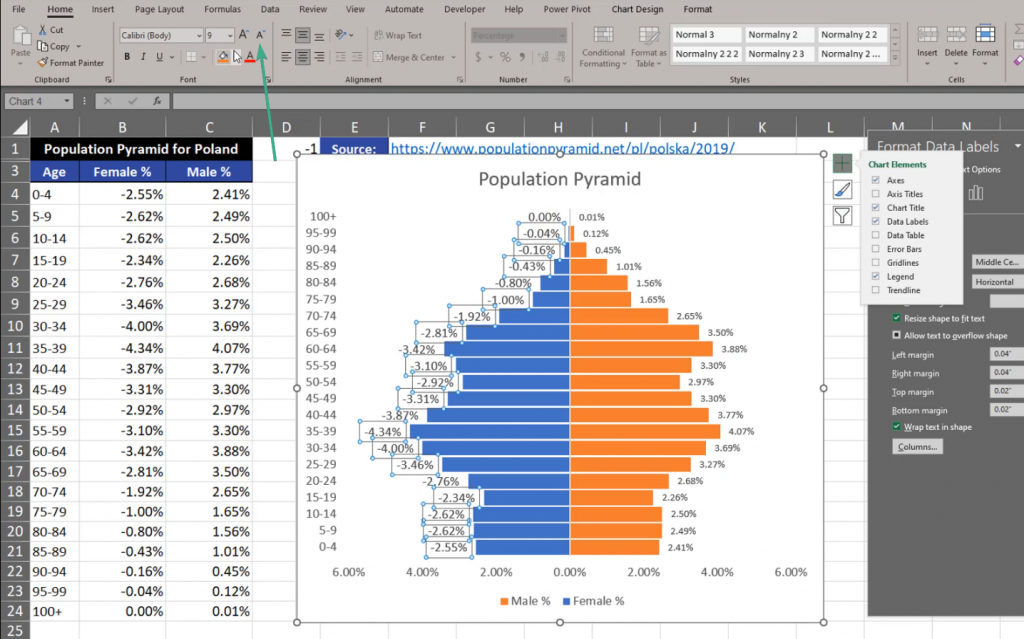
We can see that the label font is too big. Let’s make it smaller by selecting the labels and changing the font size on the ribbon (Fig. 9)
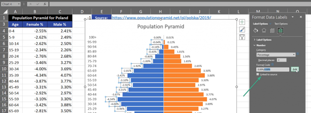
There is still one more thing we need to change. There are minus signs on the left side of the chart. So, let’s press the Ctrl + 1 shortcut and go to the Format Data Labels window. We have to open the Number tab and write the percentage once again. We separate the percentages with a semicolon, so that the percentage from the left side corresponds to the left part of the chart, and the right corresponds to the right part. Then, we press Add (Fig. 10)
In the end, I want to change the position of the legend. Let’s select the legend and press Ctrl + 1. We can see many options concerning the position of the legend (Fig. 11)
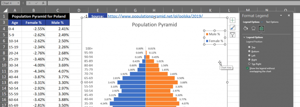
However, I want to change the position manually. Let’s drag it to the right and change its size. We can also change the size of the bars. There are many more modifications that you can implement. My Population Pyramid is finished and looks as follows (Fig. 12)