How can we check whether the given time is between the working hours or not?
Is this Time between Working Hours
In our case, work starts at 9:30 AM, and ends at 5:30 PM. Our given time, which is 6:47 isn’t between the working ours. When we change it, we can see that the color changed into red and ‘No’ turned into ‘Yes’, which means that now the time is between the working ours (Fig. 1)
Fig. 1 Our given time is between the working hours
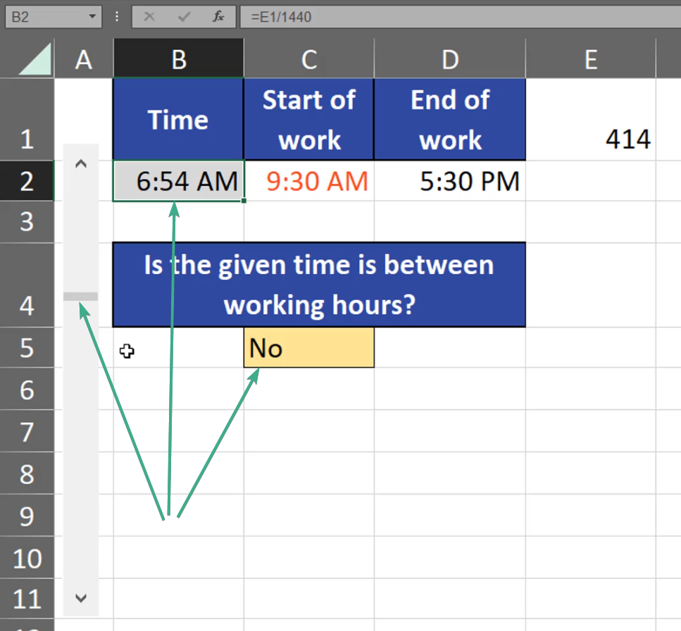
However, when we go to earlier hours we can see that the details changed (Fig. 2)
Fig. 2 Our given time isn’t between the working hours
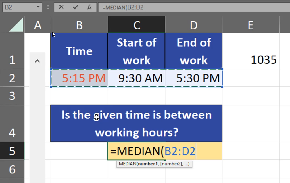
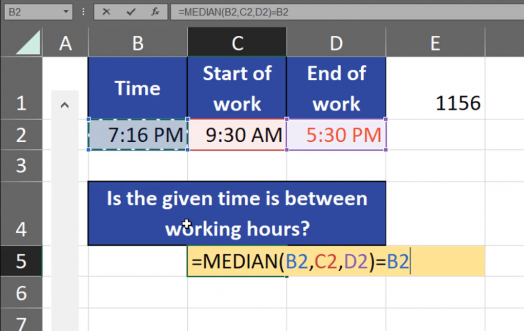
How can we check our time? The simplest solution is using the MEDIAN function that returns the value in the middle. Since all our times are in one row, we can just select the range (Fig. 3)
=MEDIAN(B2:D2)
Fig. 3 Selecting the whole range
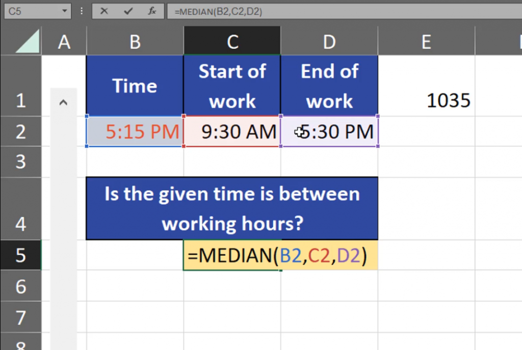
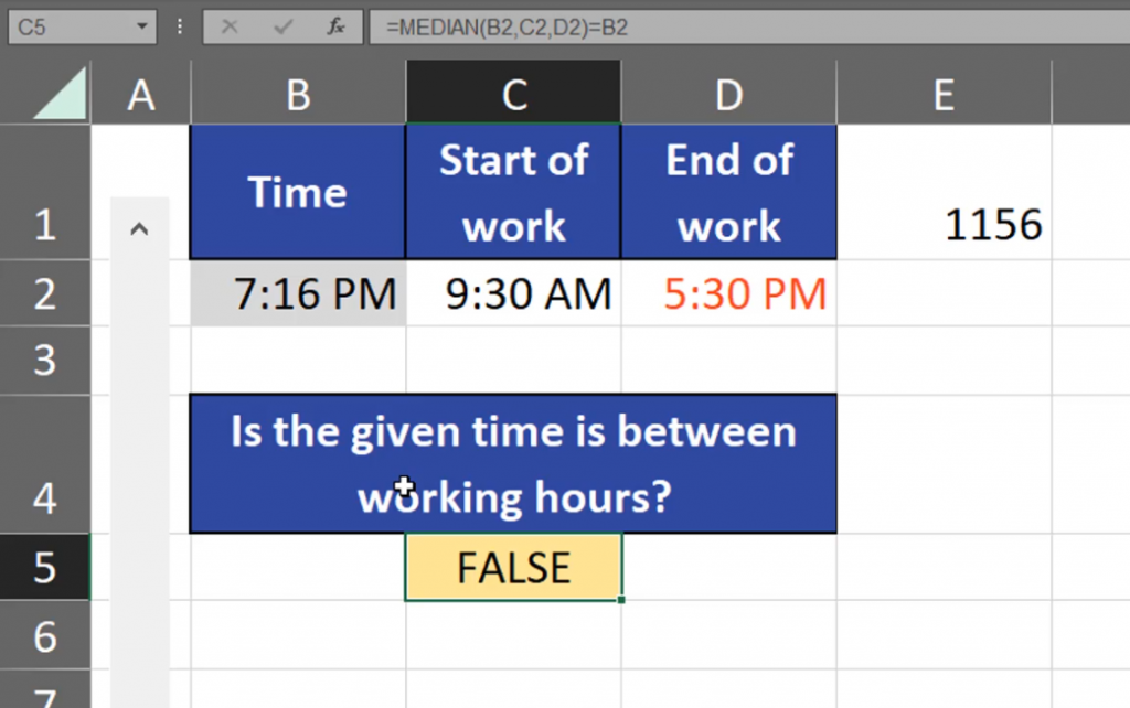
If our data is in separate cells, we can just add those cells one by one (Fig. 4)
=MEDIAN(B2,C2,D2)
Fig. 4 Selecting cells one by one
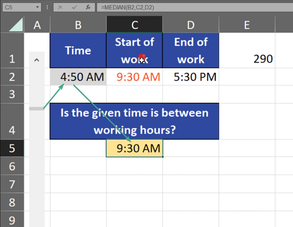
And just like that we receive the value in the middle. If this value is equal to the given time, it means it’s between the working hours. What’s curious about our median is the fact that it won’t cross our thresholds, i.e. our starting time and finishing time. It means that the smallest value our MEDIAN function can show is the starting hour, and the largest is the finishing hour (Fig. 5)
Fig. 5 The smallest value
Now, we have to check whether our time is between the working hours. We have to compare the function to the given time (Fig. 6)
=MEDIAN(B2,C2,D2)=B2
Fig. 6 Comparing
As we can see, our logical test returned FALSE (Fig. 7)
Fig. 7 FALSE
If the logical test returns TRUE, it means that the given time is between the working ours (Fig. 8)
Fig. 8 TRUE
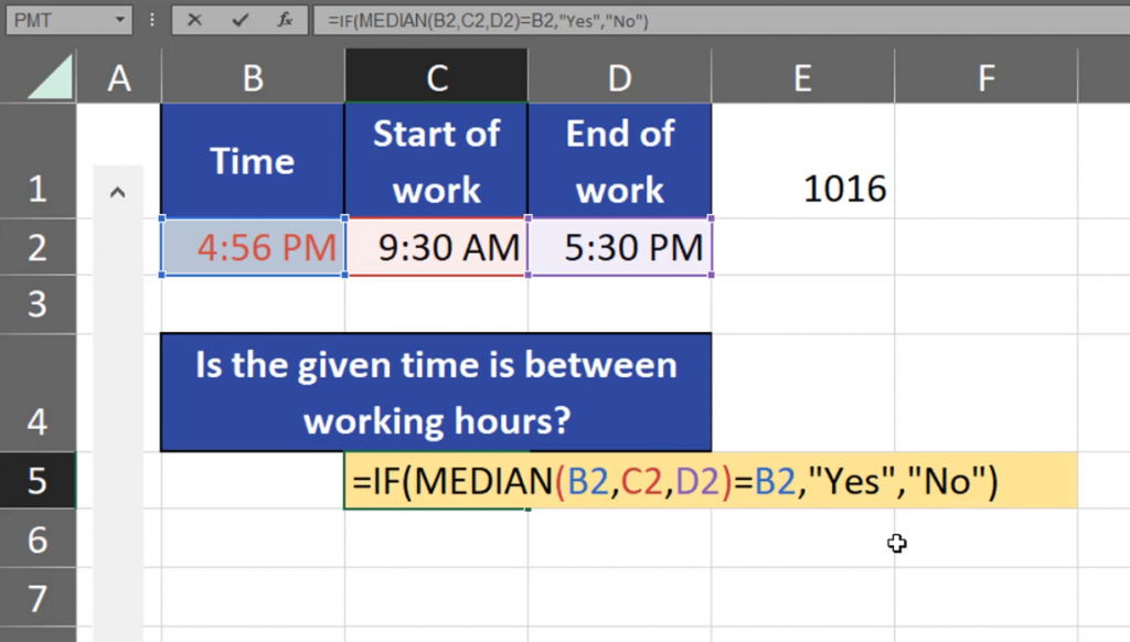
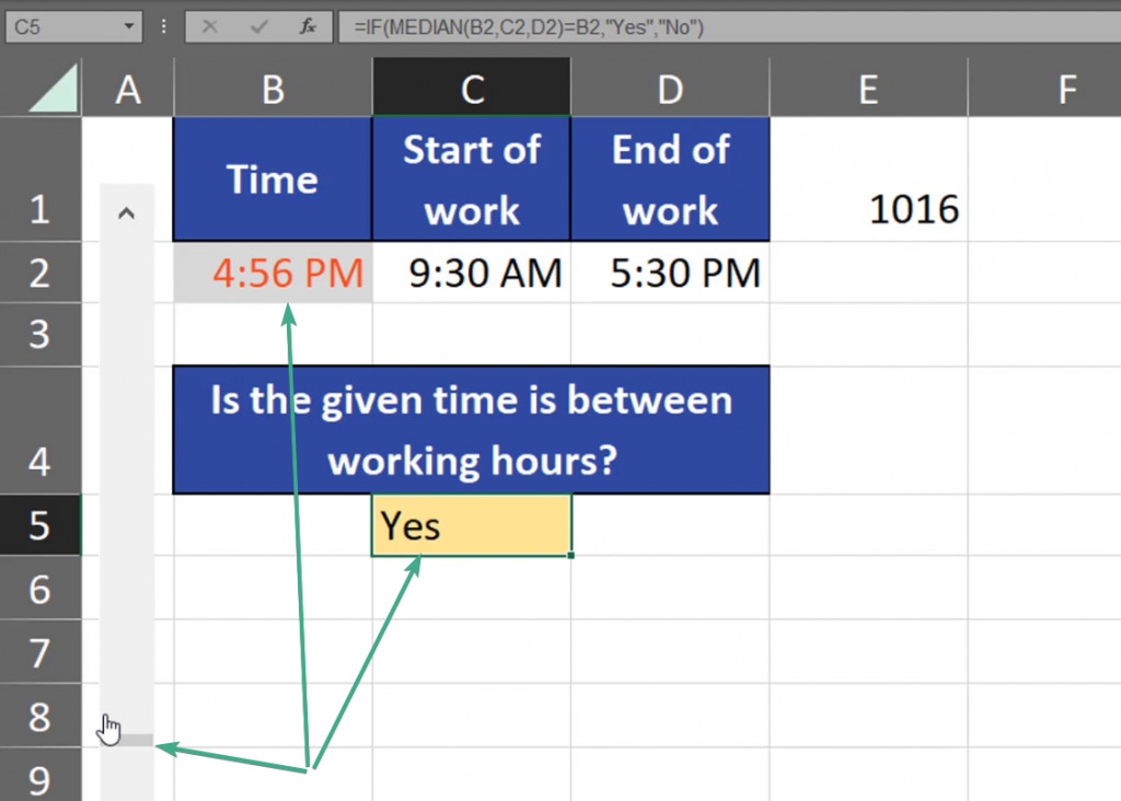
The answers we have are logical. Let’s make them more human like by adding the IF function to our MEDIAN logical test and some simple text like ‘Yes’ and ‘No’ (Fig. 9)
=IF(MEDIAN(B2,C2,D2)=B2,“Yes”,“No”)
Fig. 9 Adding the IF function
We can see that we can check whether our given time is between the working ours or no (Fig. 10)
Sometimes, we need to make many statistical operations and use many statistical functions in Excel. How can we do it?
Named ranges and statistics
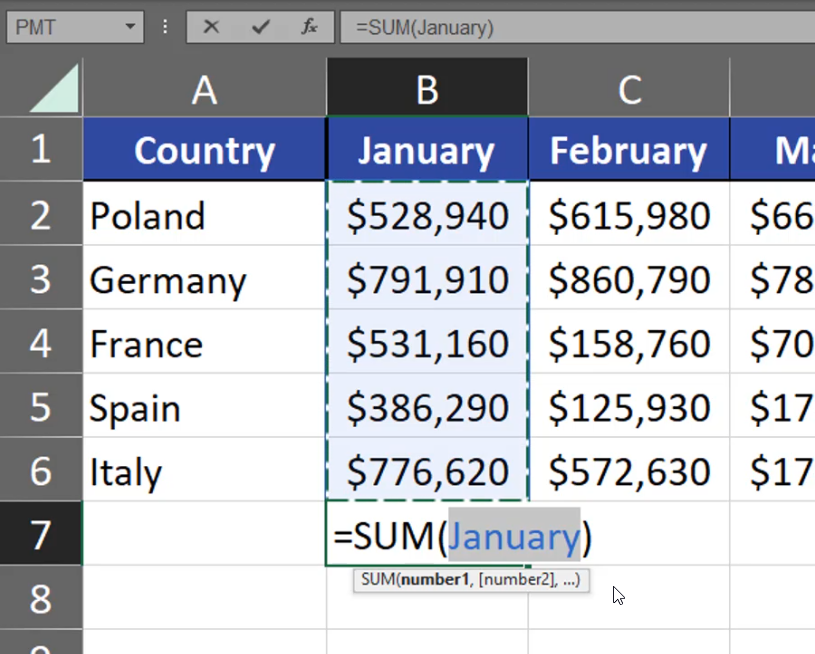
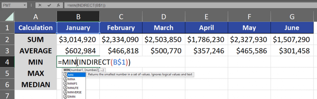
A fast and quick solution is using name ranges. For example, we have the SUM function that sums up all values from January (Fig. 1)
Fig. 1 SUM function
How can we name ranges and use them for our advantage? Let’s start with a simple example of the SUM function. For the SUM function, we have keyboard shortcut which is Alt + =. This way Excel will put the sum for January, which is a range form B2:B6 (Fig. 2)
=SUM(B2:B6)
Fig. 2 Alt + = to put the sum
In the example above we had numbers. However, let’s go to another sheet where we have no numbers. When we want to sum the numbers from the previous sheet, it’s going to be a very tedious job, as we have to move between those two sheets and write proper values. What’s more, the reference we have while using values form another sheet isn’t the easiest to understand. What we can do is naming the ranges. We just have to select a range in a column and write a proper name in the Name Box (Fig. 3).
Fig. 3 Naming the range
Now, when we are using the Alt + = shortcut under our values, Excel will automatically refer to the January range, which is B2:B6 (Fig. 4)
=SUM(January)
Fig. 4 Automatic reference
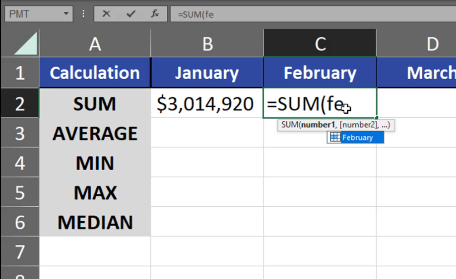
As we know, Excel remembers names. It means that we can use the name in calculation on a different sheet. When I start writing “ja” in another sheet, Excel will suggest the range name (Fig. 5). I can just accept it and sum the values from January.
Fig. 5 Excel suggested the range name
As we can see, naming ranges makes our work faster. We can also name a bigger group of columns at one time. Just select the group you want. What’s important, when you’re selecting your data, you have to select the top rows, and then the numbers beneath them. Then, go to the Formulas tab, click on the Create from Selection command and select the Top Row checkbox in the window that appeared (Fig. 6)
Fig. 6 Creating names from selection
Now, after we named our ranges, we can see that the February range is named February, the March range is named March and so on. When we move to another sheet, we can use those names (Fig. 7)
Fig. 7 Excel is suggesting the new names
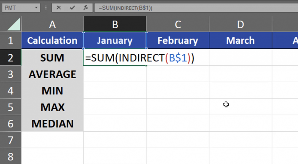
However, we can go one step further using the reference to names. I have January in cell B1. But, when I refer to cell B1, Excel won’t simply convert the text from cell B1 to a range because it just text. It means that our function won’t add anything. First of all, we have to lock the rows (B$1), then add the INDIRECT function to our calculation. Now, the INDIRECT function changes the text into a reference to the proper range (Fig. 8)
=SUM(INDIRECT(B$1))
Fig. 8 INDIRECT function
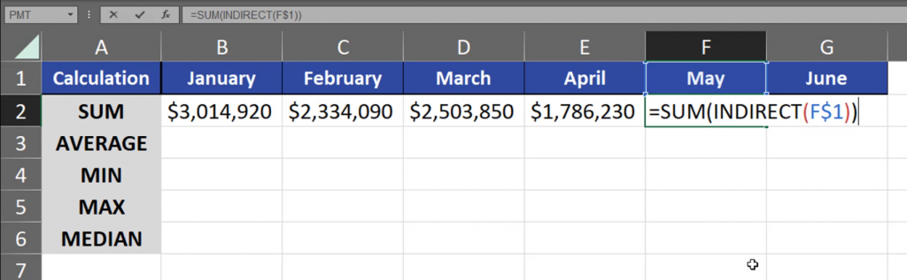
Now, when I drag the formula to the right, I will have sums from each individual month (Fig. 9)
=SUM(INDIRECT(F$1))
Fig. 9 Sum from individual months
When I copy the formula one cell lower, I’m just changing SUM into AVERAGE (Fig. 11)
=AVERAGE(INDIRECT(B$1))
Fig. 1 SUM into AVERAGE
After I drag it to the right, I have proper results. I do the same with the remaining rows (Fig. 12)
=MIN(INDIRECT(B$1))
Fig. 12 Changing the remaining names
This way, we can quickly add more statistical operations for many months using proper name ranges and the INDIRECT function.
Sometimes, we need to calculate a cubic root, square root or an nth root of a number. How can we do that?
Cubic root, square root and an nth root
First of all, we can use the SQRT function to calculate a square root (Fig. 1)
=SQRT(A3)
Fig. 1 SQRT function
And here we have our results. There is also the POWER function used for calculating the square root with the use of inverse numbers. The number for a square root is 1 divided by 2 (1/2). (Fig. 2)
=POWER(A3,1/2)
Fig. 2 POWER function
As we can see the results are the same. We can even use a simple symbol of raising a number to a power. In the case of a cubic root it will be the number from cell A3 (2), then a caret (Shift + 6). Then, the reverse of a cubic, which is 1/3 written in a parenthesis (Fig. 3)
=A3^(1/3)
Fig. 3 Cubic root
And we have our cubic roots. In the case of the fourth root, we will use the same calculation, which is a caret and, this time, 1/4 (Fig. 4)
=A3^(1/4)
Fig. 4 Fourth root
And we have our fourth root. In the case of the tenth root, I can even write this number as 0.1 (Fig. 5)
=A3^0.1
Fig. 5 Tenth root
And, just like that we have our tenth root (Fig. 6)
Fig. 6 Final results
Depending on the situation, use the calculation you understand the most.
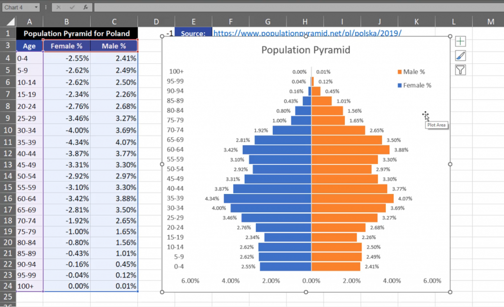
Sometimes, we need to insert a population pyramid in Excel or a chart comparing two values.
Population Pyramid Chart
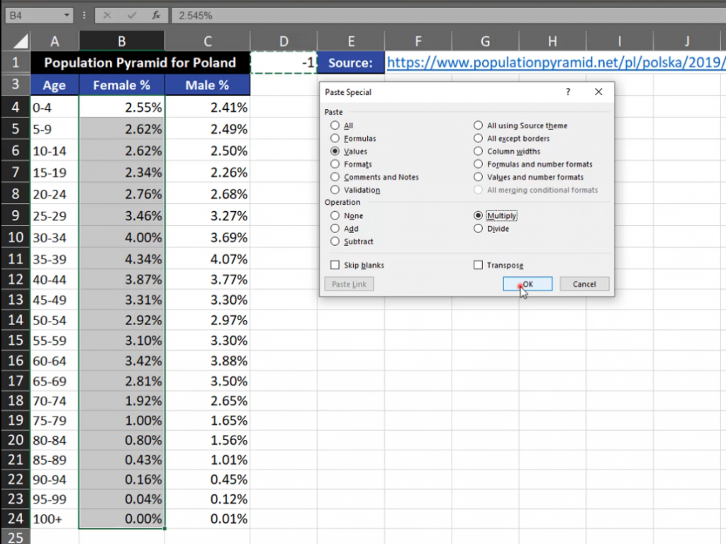
One part of the chart is on the left, while the other is on the right. In order to create something like population pyramid we have to insert a proper chart. I’m using data from Poland as I’m an Excel lover from Poland. We have to have one part of negative values, which will go to the left side of the chart. If you want to do it, you have to write ‑1 in one cell, then copy it and select all values where we want to change the sign, then use the Paste Special option (or use the Alt + Ctrl + V shortcut). In the Paste Special window, select the Values radio button and the Multiply radio button in the Operation section. It means that we will be multiplying ‑1 by the selected values (Fig. 1)
Fig. 1 Paste Special window
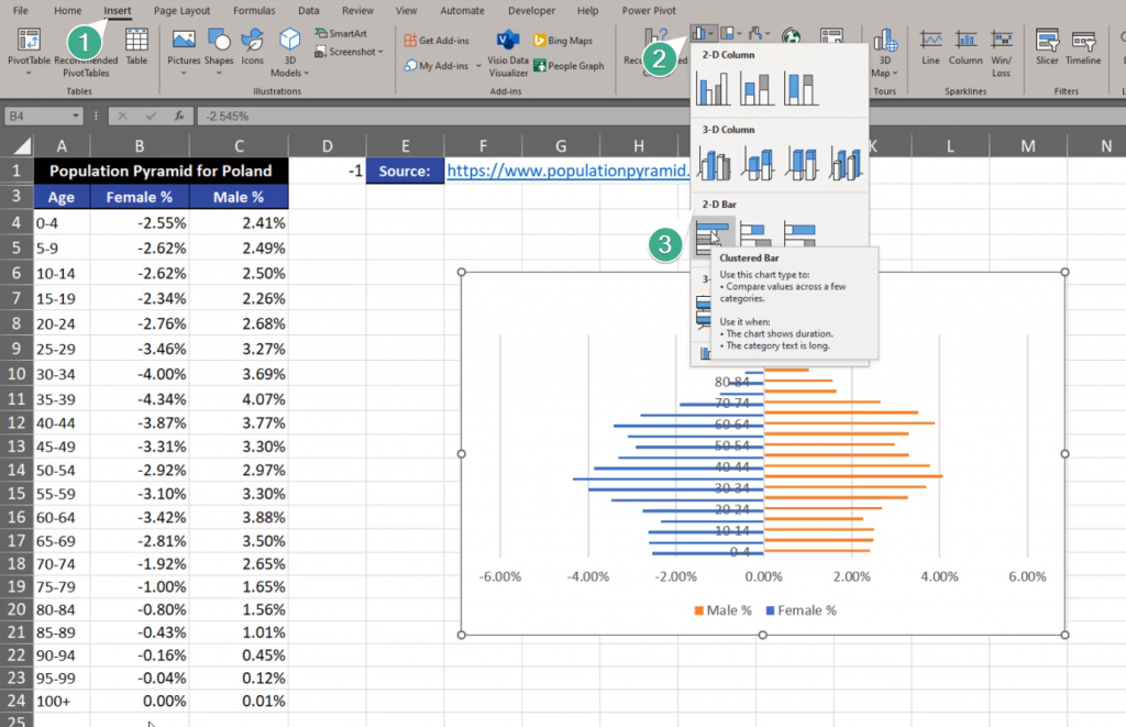
Now, we have negatives and positives, which is the left and the right side of our chart. We can insert the chart. Let’s select one cell and go to the Insert tab and find the Clustered Bar option (Fig. 2)
Fig. 2 Clustered Bar option
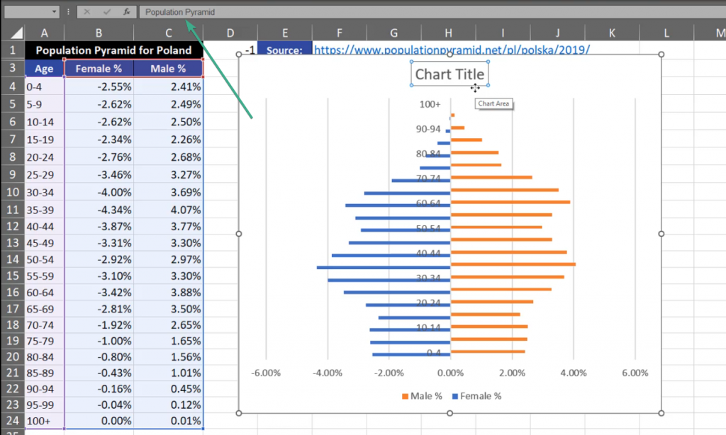
The chart that appeared isn’t good enough for us. The first modification we want to implement is changing the title. Let’s write ‘Population Pyramid’ (Fig. 3)
Fig. 3 Chart Title change
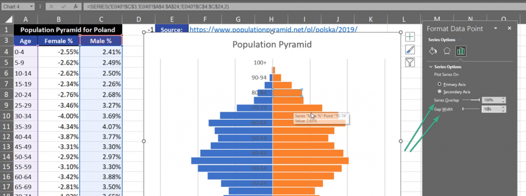
I also want to modify bars. Let’s click on them, then press Ctrl +1. Format Data Series window will appear where we have to select 100% in the Series Overlap section and set the Gap Width to 10% (Fig. 4)
Fig. 4 Series Overlap and Gap Width options
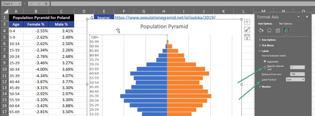
Now, the bars are larger. The next thing is the Vertical Axis. Click Ctrl + 1 shortcut and go to the Labels tab. Set the Label Position to Low which, in our case, is the left side. In the Specify interval unit let’s leave 1 (Fig. 5)
Fig. 5 Label Position and Specify Interval Unit options
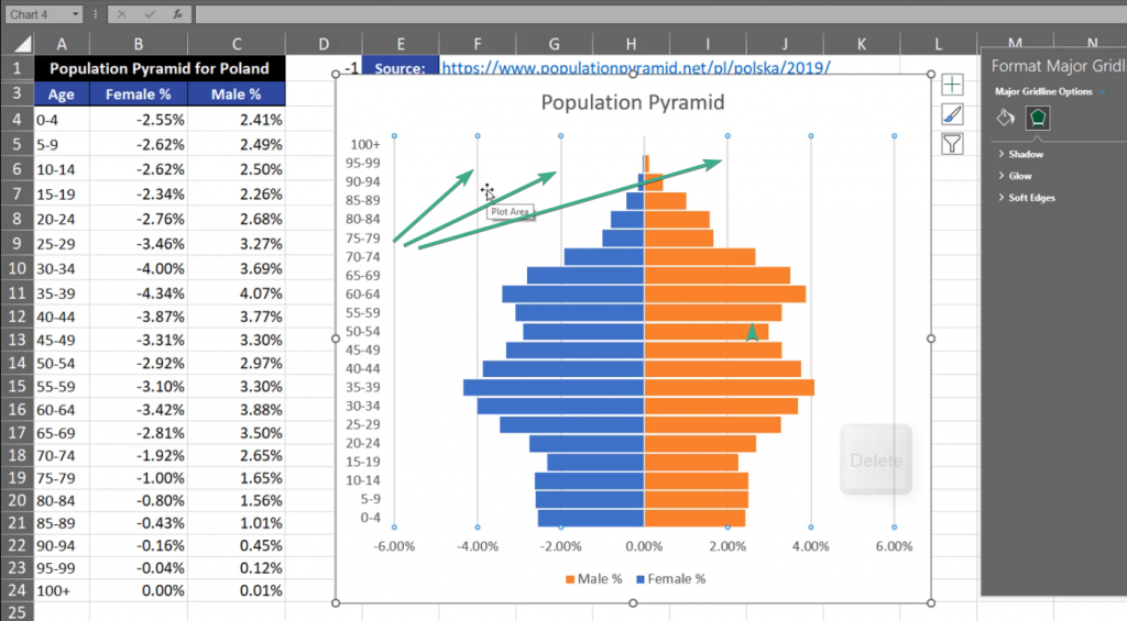
Now, the chart looks much better, but I don’t like the vertical lines here. Let’s click it and press the Delete key (Fig. 6)
Fig. 6 Vertical lines not needed
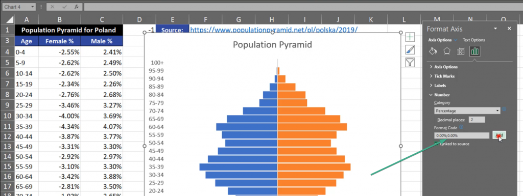
The next thing we want to change is the horizontal axis where we have person values. It means that we don’t need any negative values. We have to select it, press Ctrl + 1, then in the Format Axis window, we need to go to the Numbers bar. In the Format Code bar, we need to repeat the percent code for the negative values. Let’s add a semicolon, then write 0.00% without any minus sign. Then, we click on the Add button (Fig. 7)
Fig. 7 Format Code bar
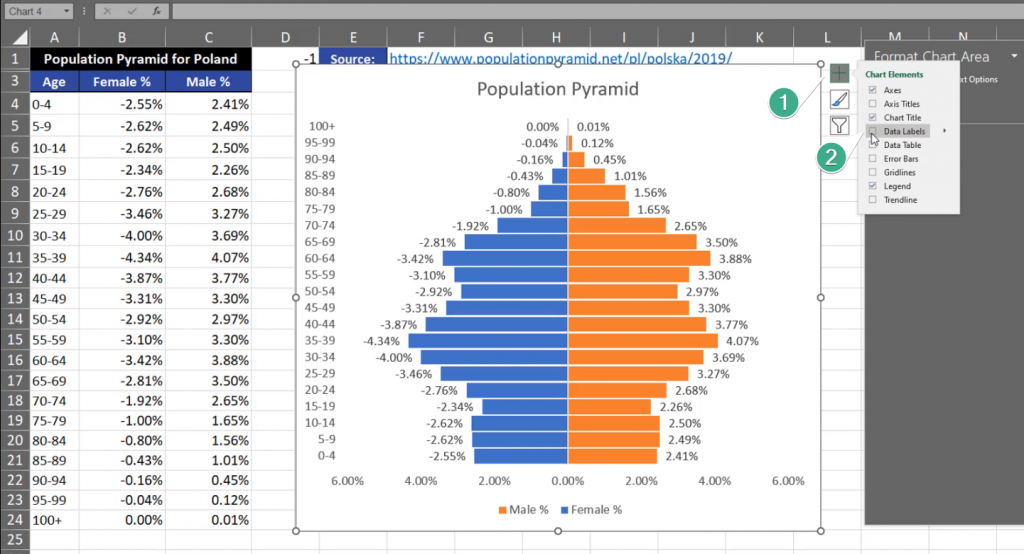
Now, we have positive values on the left and on the right side of the chart. What I’m still missing is Data Labels. We have to press the plus sign and select the Data Labels checkbox (Fig. 8)
Fig. 8 Adding Data Labels
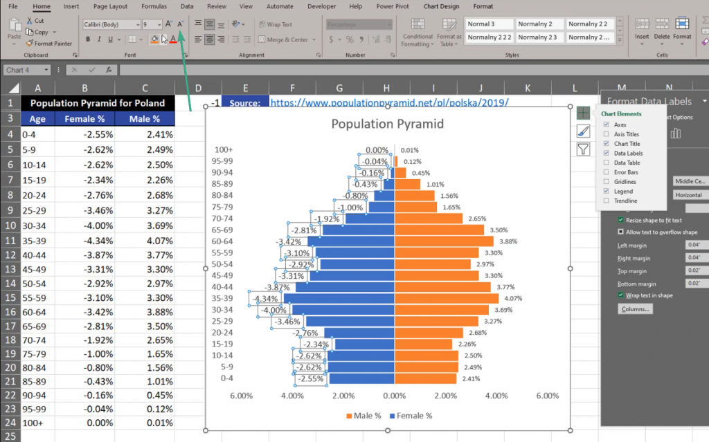
We can see that the label font is too big. Let’s make it smaller by selecting the labels and changing the font size on the ribbon (Fig. 9)
Fig. 9 Changing the font size
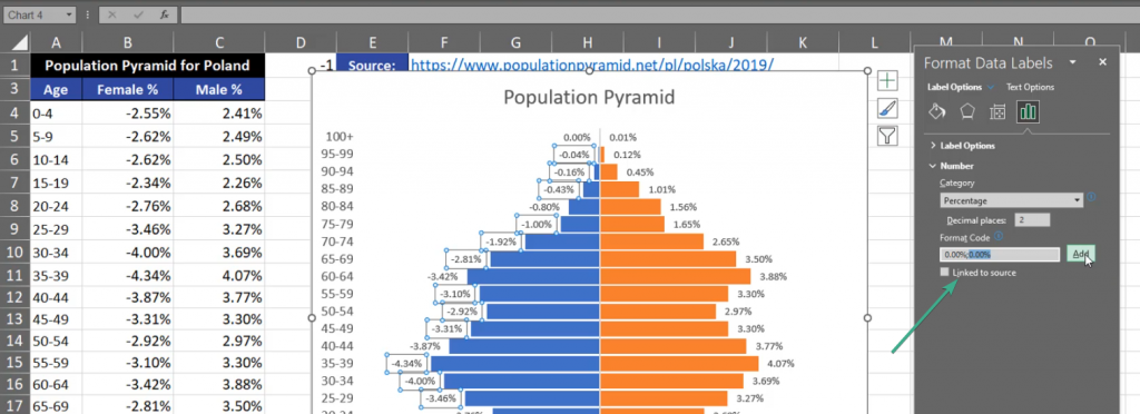
There is still one more thing we need to change. There are minus signs on the left side of the chart. So, let’s press the Ctrl + 1 shortcut and go to the Format Data Labels window. We have to open the Number tab and write the percentage once again. We separate the percentages with a semicolon, so that the percentage from the left side corresponds to the left part of the chart, and the right corresponds to the right part. Then, we press Add (Fig. 10)
Fig. 10 Two percentages
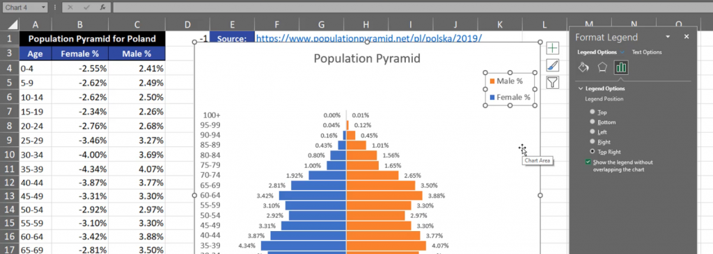
In the end, I want to change the position of the legend. Let’s select the legend and press Ctrl + 1. We can see many options concerning the position of the legend (Fig. 11)
Fig. 11 Legend Positions
However, I want to change the position manually. Let’s drag it to the right and change its size. We can also change the size of the bars. There are many more modifications that you can implement. My Population Pyramid is finished and looks as follows (Fig. 12)
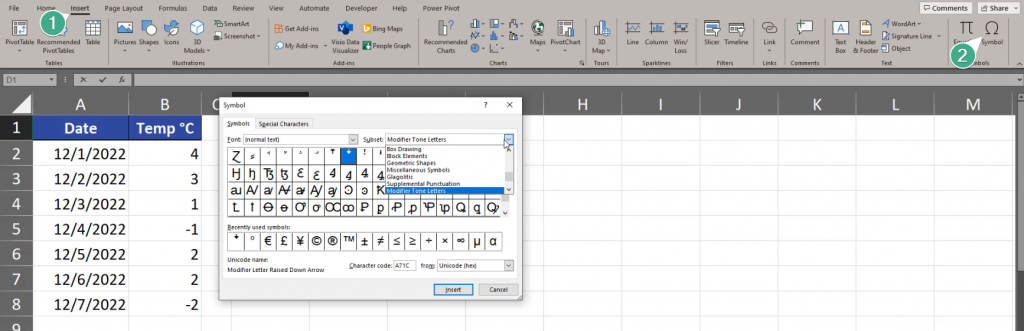
Sometimes, we want to add a degree sign to numbers. How can we do it?
Add degree sign (°C) to numbers
Let’s say we want to show temperature in degrees Celsius or Fahrenheit. The first thing we want to do is inserting the correct sign. We can either copy it from the internet or we can choose the Symbol command from the Insert tab (Fig. 1).
Fig. 1 Adding a symbol
In the Symbol window that appears, we’re choosing the Latin‑1 Subset (1), then the Degree Sign, whose name we can see at the bottom of this window. We click the Insert and Close buttons (Fig. 2).
Fig. 2 Symbol window
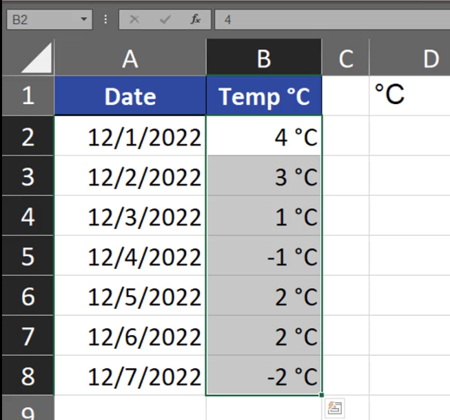
We can see the Degree Sign in cell D1. After adding C, we have the full symbol. Now, we can copy the symbol in the edit mode, then select all cells with numbers to which we want to add the sign. Then, we press the Ctrl + 1 shortcut. In the Format Cells window we’re choosing the Custom Category, then we’re choosing 0 and we can paste the °C sign. In the Sample bar we can preview what our final text will look like in the end. If we want to make sure that our text will be show as a text in the end, we can write it in double quotes. In this case, it’s a bulletproof solution (Fig. 4).
Fig. 4 Format cells window
And we have our signs correctly inserted (Fig. 5).
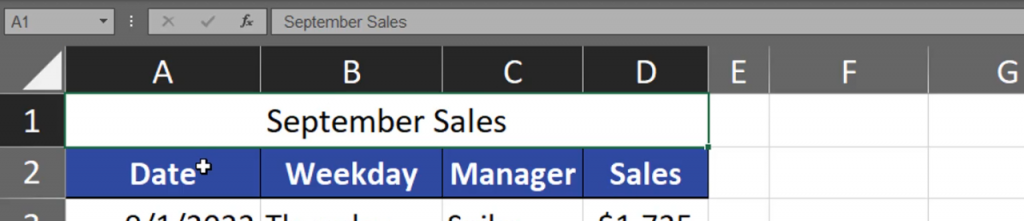
How can we create a headline title that is in the Center Across Selection mode?
Merge Cells vs Center across selection
In Excel, we have two solutions. We can select sales and use the Megre&Center command from the Home tab (Fig. 1)
Fig. 1 Megre&Center command
Excel will merge cells into one cell and align it in the center (Fig. 2).
Fig. 2 One, centered cell
This solution, however, has got a small drawback as it created one cell instead of many cells. When we try to select only one column and go a bit too high, we end up in selecting every column (Fig. 3)
Fig. 3 All columns are selected
But, when we go down again, we will select only one column again, so it’s not a big problem. Sometimes, we want to move our data a bit to the right or left. When we try to copy our range, we can’t select only cell B1, which is a bit problematic. After selecting the whole range, we want to move it to the right. However, there’s still a problem. If we want to move the range only a bit to the left or right, we cannot do it (Fig. 4).
Fig. 4 Merged cells cannot be moved only a bit
We have to go far enough to the right to make Excel copy the merged cell (Fig. 5).
Fig. 5 Merged cells moved
I want to show you one more solution. Let’s deselect the Megre&Center command. Now that we have our range selected, we can press the Ctrl + 1 shortcut to go to the Format Cells window. In the window, we have to go to the Alignment tab, then select theCenter Across Selection command in the Horizontal area, and press OK (Fig. 6).
Fig. 6 Format Cells window
We can see that our selected cells have merged. But this time, when we try to select one whole column, we can do it (Fig. 7).
Fig. 7 Whole column selected
You have to remember that now the value is located in cell A1. There’s nothing in B1, C1 and D1 cells. The value was just centered across selection. Let’s now change the coloring of the headline title and try to move it a bit to the right (Fig. 8).
Fig. 8 Moving the range
As we can see, it’s possible (Fig. 9).
Fig. 9 The whole range moved a bit
When we have the cell in the Center Across Selection mode, it’s also important that when we want to add some text to one of the cells, the Center Across Selection option will work only on the cells that are not filled (Fig. 10)
Fig. 10 Center Across Selection working only in cells A1, B1 and C1
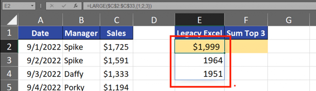
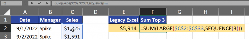
How to calculate a sum or an average of top 3 maximal values?
Sum of top 3 values
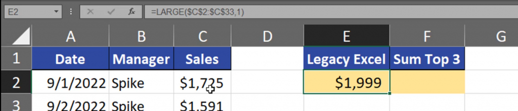
In Legacy Excel, we can use the LARGE function, in which we need to select the range for our calculation. In the k argument let’s write 1 (Fig. 1).
=LARGE($C$2:$C$33,1)
Fig. 1 LARGE function
After entering the function, we have the largest value (Fig. 2).
Fig. 2 The largest value
Now, we can copy the function and add the second and the third largest value (Fig. 3).
This way we have the sum of 3 largest values (Fig. 4).
Fig. 4 The sum of 3 largest values
This solution, however, is the least dynamic of all solutions we have. We can make this formula shorter by hardcoding our values. We have to write 1, 2 and 3 as an array (Fig. 5).
=LARGE($C$2:$C$33,{1;2;3})
Fig. 5 The first, second and third value written as an array
This way Excel will return three largest values. I’m using Dynamic Excel, so the results are spilled (Fig. 6).
Fig. 6 Spilled results
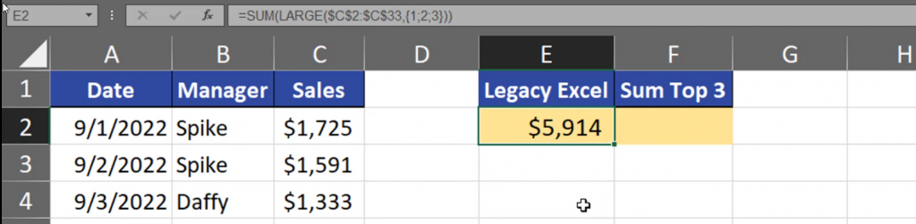
Now, that our values have been hard-coded, we can sum them by using the SUM function. We can also use this function to sum up averages (Fig. 7).
=SUM(LARGE($C$2:$C$33,{1;2;3}))
Fig. 7 Summing up the largest values
Our results (Fig. 8).
Fig. 8 Results
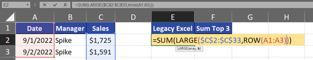
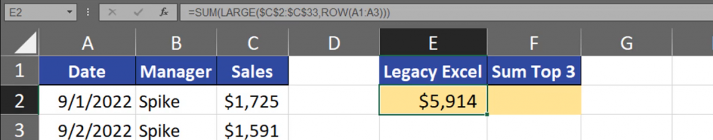
This solution, however, is hard to modify, so we can make it a bit more dynamic. We can use the ROW function and select the first three rows from the sheet. This way our solution is more dynamic (Fig. 9).
=SUM(LARGE,($C$2:$C$33,ROW(A1:A3)))
Fig. 9 A more dynamic solution
Results (Fig. 10).
Fig. 10 Results
But, in Legacy Excel, we should use the SUMPRODUCT function instead of the SUM function or use the Ctrl + Shift + Enter shortcut to put the formula into the cell (Fig. 11).
=SUMPRODUCT(LARGE,($C$2:$C$33,ROW(A1:A3)))
Fig. 11 SUMPRODUCT function
And we have the result. In the second column, in Dynamic Array Excel, we still need the SUM and LARGE functions, then the array which is the range we will look at. Then, we can use the SEQUENCE function to create a sequence of proper numbers, let’s take 3 (Fig. 12).
=SUM(LARGE($C$2:$C$33,SEQUENCE(3)))
Fig. 12 Adding the SEQUENCE function
We have proper results (Fig. 13).
Fig. 13 Results
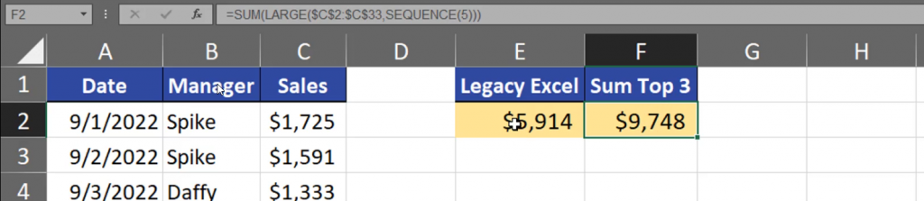
This solution is much more dynamic. Let’s change the number into 5 (Fig. 14).
=SUM(LARGE($C$2:$C$33,SEQUENCE(5)))
Fig. 14 3 changed into 5
Here is the result (Fig. 15).
Fig. 15 Results
In Legacy Excel, we can also change one number. Let’s change the number of rows in the range from 3 to 5 (Fig. 16).
=SUMPRODUCT(LARGE($C$2:$C$33,ROW(A1:A5)))
Fig. 16 A3 into A5
And we have the same result (Fig. 17).
Fig. 17 Result
We have to remember which version of Excel we have and which solution we can use.
Sometimes, you need to create a running total in pivot tables. How to do it properly?
Running Total in Pivot Table
Let’s start with creating a pivot table. Select one cell from our data and go to the Insert tab and select the Pivot Table command. A Pivot table from table or range window will appear, where we have our range. We need to select the Existing worksheet radio button and write the location, which, in our case, will be cell F1. Let’s click the OK button (Fig. 1).
Fig. 1 Creating a pivot table
And there we have it. In our pivot table we need to drag the Date to the Rows labels.
Fig. 2 Dragging the date
Now, depending on the Excel version, we have an option of Group by dates. I’m going to group our date by months and years (Fig. 3).
Fig. 3 Grouping
We have our table. Now, I want to add Income so let’s press the Income checkbox (Fig. 4).
Fig. 4 Income checkbox
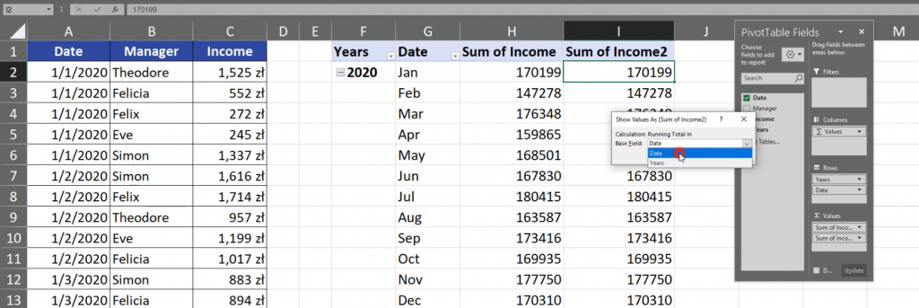
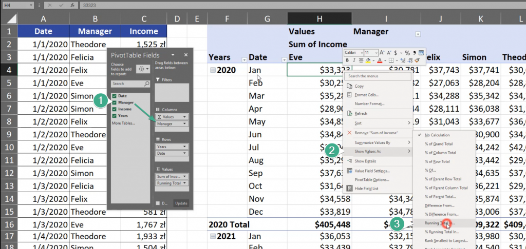
Now, I want to have the income and the running total for the income, so let’s drag the Income two times to the Values area. We can see that we have Sum of Income and Sum of Income 2, where we actually want to have our running total (Fig. 5).
Fig. 5 Income and Income 2
Let’s right click any value from Income 2, then select the Show Values as and then the Running Total In option (Fig. 6).
Fig. 6 Selecting the Running Total option
Now, we have to decide whether we want to base our running total on Date or Years Field. Let’s take Date (Fig. 7).
Fig. 7 Date Field
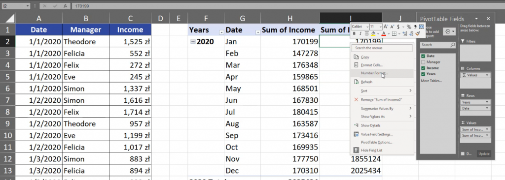
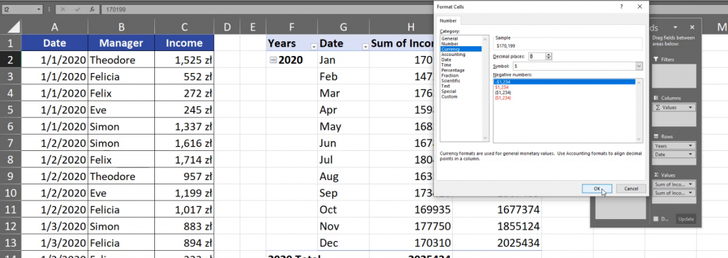
Now, we can see that in the Income 2 column we have bigger numbers. Let’s format them by pressing any cell in the column and choosing the Number Format option (Fig. 8).
Fig. 8 Number Format option
In the Format Cell window, let’s choose the Currency category, in Decimal places let’s write 0 and press the OK button. Let’s do the same in the Sum of Income column (Fig. 9).
Fig. 9 Format cell window
Now, we can see that we are working with money. In each month we have bigger and bigger numbers which means that we have the running total in this column. We can change the name of Sum of Income 2 into Running Total. Since we are using the Date Field as our reference point, we have the running total in 2020. In 2021 Excel counts from the start, which means that we have the running total only for 2021. The same is with 2022. If we change the Date field into the Years field in the Show Values as (Running Total) window, we will have the same value in the first year and in the Sum of Income column (Fig. 10).
Fig. 10 Years
However, in the next year, we have the the sum from January 2021 and January 2020. In February, we have the sum from February 2021 and 2020. In 2022, we have sums from three Februaries (Fig. 11).
Fig. 11 Sums from three Ferbuaries
Let’s drag Manager into the columns header (Fig. 12).
Fig. 12 Dragging Manager into headers
By doing so, we can show value from the Manager’s perspective, which means a horizontal view.
Fig. 13 Horizontal view
However, this type of data isn’t a proper one to show it this way, so let’s get back by pressing Ctrl + Z two times and see that we can also create a percent running total by going to the % Running Total In option and choose the Date Field (Fig. 14).
Fig. 14 Percentage Running Total
Now, we can see the values as percentage (Fig. 15).
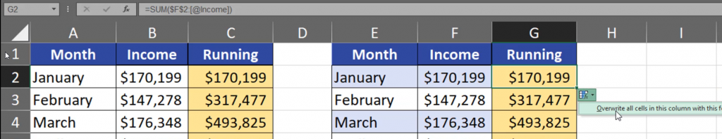
The most versatile solution I know is using the SUM function and a dynamic range which in our case is $B$2:B2. However, the most important fact is that we have to lock (F4 key) the first part of this range (Fig. 1).
=SUM($B$2:B2)
Fig. 1 SUM function
When we copy our formula down, we can see that the first part of the range will always refer to cell B2, but the second one will go down as we drag the formula. This way, we have a range that expands as we go down. It’s the most versatile solution (Fig. 2).
=SUM($B$2:B4)
Fig. 2 An expanding range
This solution has problems with Excel tables. When we sum from F2 to F2 cells and press F4 key to lock it, everything looks fine. However, when we add new data to our table, the last cell will expand because it refers to the whole column July -> August (Fig. 3).
Fig. 3 Adding a new value
In this case, we have to modify our range. Instead of cell F2 we can use the table nomenclature. When we click cell F2, Excel will refer to this table row, where @ means this table row, and Income means the column we are referring to (Fig. 4).
=SUM($F$2:[@Income])
Fig. 4 Range modification
We have to overwrite all cells (Fig. 5).
Fig. 5 Overwriting cells
This way we got proper results. We can check if it works properly by adding some new rows. After we added two rows, the results are still correct (Fig. 6).
Fig. 6 Correct formula operation
The only drawback of this formula is that we won’t see the whole range because Excel won’t select the whole range. Theoretically, the last cell should include the whole column but Excel selects only the first and the last row (Fig. 7).
=SUM($F$2:[@Income])
Fig. 7 The formula in the last cell
We won’t see it, but Excel will. We have to remember that Excel will create a proper reference and we can create a proper running total, even in Excel tables.
If you want to calculate a median value with a condition, you cannot use a simple MEDIAN function because it needs only numbers. We have to use another function that will reduce the number of wages we look at.
Median with condition
Typically, when we want to add a condition to another function we can use the IF function and make a logical test. In our case, the logical test will be simple. We just have to check each cell in the Department column whether it’s equal to the name of the Department we look at now. Since we are comparing a single cell to a whole range, Excel will check every single cell in a given range (Fig. 1).
Fig. 1 Comparing a single cell to a range of cells
If a cell in the range is equal to the target cell, we want the function to return proper wages, i.e. the wages from the same row. If the logical test result is FALSE, we want to have something that the MEDIAN function will ignore which, in most cases, is an empty text string. However, I want to show you that the IF function really returns something so let’s write “no” (Fig. 2).
=IF($B$2:$B$13=E2,$C$2:$C$13,“no”)
Fig. 2 IF function
We can see that Dynamic Array Excel spilled the results and we have wages only for the departments we chose. For other departments we have ‘no’. Now, we can put this function into the MEDIAN function (Fig. 3).
=MEDIAN(IF($B$2:$B$13=E2,$C$2:$C$13,“no”))
Fig. 3 MEDIAN function with IF function
Now, we’ve calculated the median value with a condition for each department. We can see that for HR it’s $4,000, for IT it’s $8,100 and for Marketing it’s $5,900. Those are the middle values for each department (Fig. 4).