Do you want to put a Pareto chart in Excel? I will show you how.
If you want to put a chart on which you have columns that represent income and a line that represents the cumulative percent income, follow me.
From Excel 2016, you can simply go to the Insert tab and choose the Pareto chart from the Histogram command (Fig. 1)

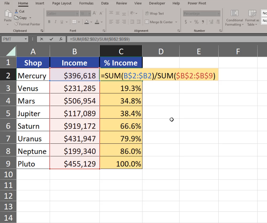
And you have the Pareto chart ready. However, the charts from Excel 2016 have some drawbacks. The line isn’t an actual series of the chart. It means that we cannot add data labels there. That’s why I don’t prefer using this type of chart. What I prefer is the earlier version that gives me more freedom concerning value changing, although it requires more calculations. We have to calculate the cumulative percent income on our own (Fig. 2)
=SUM(B$2:$B2)/SUM($B$2:$B$9)
Now, we can insert a simple column chart. Since the income is enormously bigger that the percentage, we aren’t able to see the income columns at all, but we want to select them (Fig. 3). How can we do it?

We can select our chart and go to the Format tab. On the left we can see all elements of the chart. We are interested in the Series “% Income” option (Fig. 4)

We can see now that the series is selected on the chart. Let’s press Ctrl + 1 and go to Format Data Series, Series Options, Plot Series On, and select the Secondary Axis option. Now we have % income on a different axis (Fig. 5)

Now, we can change the chart type into a chart that will represent income better. We have to click on the chart element once, then go to the Insert tab and the Line chart with Markers option (Fig. 6)

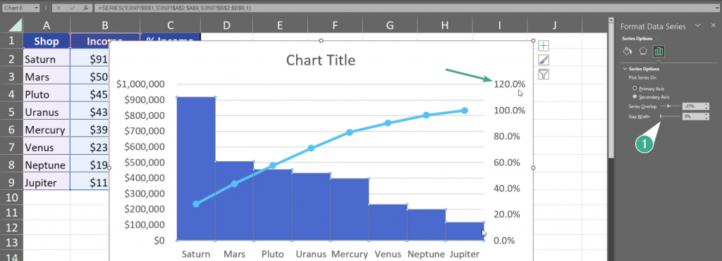
Since we are creating a Pareto chart ourselves, the values aren’t sorted and we have to do it manually. We just select one cell in our data, then go to the Data tab and choose the from Z to A option (Fig. 7)

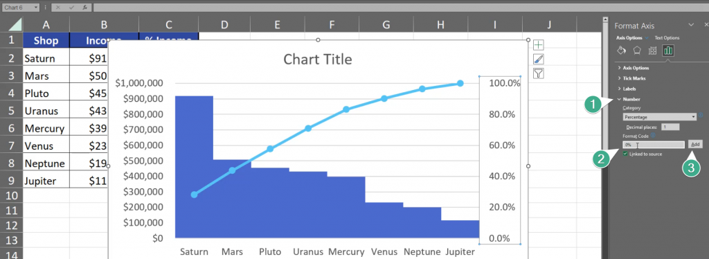
Now the data on the chart is nicely sorted and it looks more like a Pareto chart. We still have to add modifications to make it a real Pareto chart. First of all, let’s select a column and press Ctrl + 1. On the right, we have the Gap Width option. Let’s slide it to 0%. Now, let’s go to the secondary axis. It goes up to 120%, however our maximum is 100% (Fig. 8)
We have to select the axis, press Ctrl + 1, go to Axis Options and write 1 in the Maximum bar, which equals 100%. We also change our Major Units to 0.2 which means that there will be less percent numbers showed on the axis (Fig. 9)

We still don’t need the 0 after dot in our percentages, so let’s go to Numbers and change the Format Code from 0.0% to 0% and click Add (Fig. 10)
Now, let’s go to the Income Format Axis. Press the axis and Ctrl + 1. Let’s change the Major from 100000 to 200000. This way the chart will show less numbers (Fig. 11)

What I care about the most right now are data labels for the line. Let’s click once on the line, click on the plus sign and we have Data Labels option. Let’s place them above our line (Fig. 12)

We still need to set a proper title. Let’s just write Pareto. After implementing the most important changes, the Pareto chart looks like that (Fig. 13)
