Today, we want to learn how to transpose our data, i.e. how to switch columns with rows.
Switch Rows with Columns — data transposing
We have two solutions to choose, a static one and a dynamic one.
Let’s use the first one. We need to copy our data (1) and then right click on our target cell (2). From the pop-up menu, we select the Transpose option (3) (Fig. 1)
Fig. 1 Transpose option
We can see that our data has been transposed (Fig. 2)
Fig. 2 Transposed data
Now, let’s use the dynamic solution. Here, we just use the TRANSPOSE function and select the array we want to transpose (Fig. 3)
=TRANSPOSE(A1:B6)
Fig. 3 TRANSPOSE function
And we have our data transposed. However, we can see here that Excel didn’t copy the cell formatting. If we want the same formatting, we should copy it from somewhere else (1) using the Format Painter (2) option, and use it in the target place (3) (Fig. 4)
Fig. 4 Copying the cell formatting
When we change something in our original data, the data in the static solution won’t change, but the function will.
In versions older that the Dynamic Array Excel, we should select a proper range before putting the formula in a cell, then press the Ctrl + Shift + Enter combination to enter it as an array formula.
Do you want to round the working time to the nearest 15 minutes? I will show you how to do it.
Round time to nearest 15 minutes MROUND, FLOOR or CEILING functions
We can round our working time to the nearest multiple of 15 minutes. In most cases, when we round in Excel and reach the middle point, we start to round up. In the case of 15 minutes, the middle point is 7.5 minute. Now, let’s start the rounding. It’s a simple task. We can just use the MROUND function, write the number, which in our case will be the time, and then write the multiple as time, i.e. in double quotes. In this case, the first two digits correspond to hours, and the last two ones correspond to minutes. If we need seconds, we just write them further (Fig. 1)
=MROUND(A2,“00:15:00”)
Fig. 1 MROUND function
Now, let’s check our time. In the first three examples, we didn’t reach the middle point, so we go down. However, after we pass the middle point, which is shown as a threshold, we start rounding up. In the last but one example, we have exactly the same value, so we leave it just as it is. However, in the very last example, we didn’t reach the next middle point, so we still round down (Fig. 2)
Fig. 2 Rounding with the MROUND function
Sometimes, we always want to round down. In this case, we can use the FLOOR function. In the first argument, we have to write the time. In the second one, which is called significance, we write the same multiple as in the MROUND function, which is time in double quotes (Fig. 3)
=FLOOR(D2,“00:15”)
Fig. 3 FLOOR function
In this case, we always want to round down. It means that even when we go to halfway, we still go down. What’s more, even if we are very close to the next multiple, like in the last but one example, we still round down. Even, when we pass the multiple, we still round down, but this time to the next multiple, as in the last example (Fig. 4)
Fig. 4 Rounding with the FLOOR function
When we want to round up, we can use the CEILING function. We write the same arguments as in the previous functions. In this case, it’s enough if we pass the previous multiple by only one second, and the rounding will go up. Moreover, when we pass the next multiple by only a tiny bit, let’s say one hundredth of a second, we will go up to the next multiple (Fig. 5)
Fig. 5 Rounding with the CEILING function
Summing up, when we use the CEILING function, we always go up. When we use the FLOOR function, we always go down. And when we use the MROUND function, we go to the nearest multiple. The most important is the middle point. We can, of course, write any time we want in the second argument of those functions.
Do you want to put a Pareto chart in Excel? I will show you how.
How to Create A Pareto Chart
If you want to put a chart on which you have columns that represent income and a line that represents the cumulative percent income, follow me.
From Excel 2016, you can simply go to the Insert tab and choose the Pareto chart from the Histogram command (Fig. 1)
Fig. 1 Inserting a Pareto chart
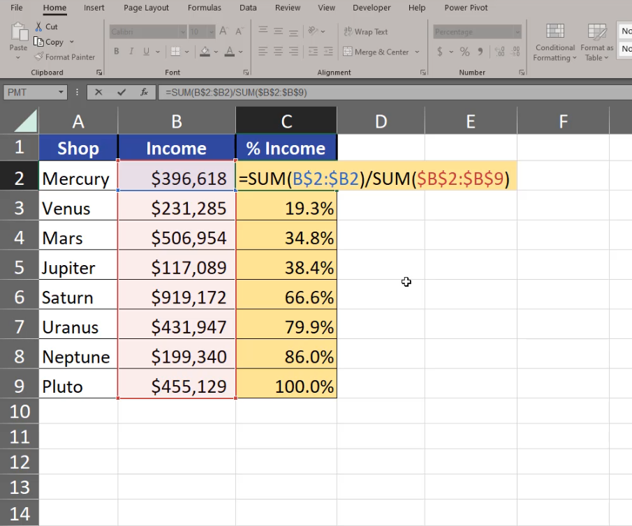
And you have the Pareto chart ready. However, the charts from Excel 2016 have some drawbacks. The line isn’t an actual series of the chart. It means that we cannot add data labels there. That’s why I don’t prefer using this type of chart. What I prefer is the earlier version that gives me more freedom concerning value changing, although it requires more calculations. We have to calculate the cumulative percent income on our own (Fig. 2)
=SUM(B$2:$B2)/SUM($B$2:$B$9)
Fig. 2 Cumulative percent calculations
Now, we can insert a simple column chart. Since the income is enormously bigger that the percentage, we aren’t able to see the income columns at all, but we want to select them (Fig. 3). How can we do it?
Fig. 3 No % Income columns
We can select our chart and go to the Format tab. On the left we can see all elements of the chart. We are interested in the Series “% Income” option (Fig. 4)
Fig. 4 Series “% Income”
We can see now that the series is selected on the chart. Let’s press Ctrl + 1 and go to Format Data Series, Series Options, Plot Series On, and select the Secondary Axis option. Now we have % income on a different axis (Fig. 5)
Fig. 5 Secondary Axis options
Now, we can change the chart type into a chart that will represent income better. We have to click on the chart element once, then go to the Insert tab and the Line chart with Markers option (Fig. 6)
Fig. 6 Line Chart with Markers
Since we are creating a Pareto chart ourselves, the values aren’t sorted and we have to do it manually. We just select one cell in our data, then go to the Data tab and choose the from Z to A option (Fig. 7)
Fig. 7 Data sorting
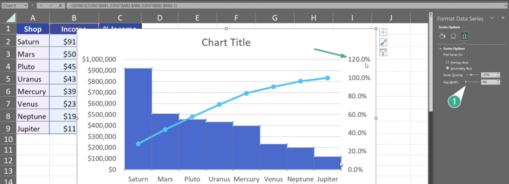
Now the data on the chart is nicely sorted and it looks more like a Pareto chart. We still have to add modifications to make it a real Pareto chart. First of all, let’s select a column and press Ctrl + 1. On the right, we have the Gap Width option. Let’s slide it to 0%. Now, let’s go to the secondary axis. It goes up to 120%, however our maximum is 100% (Fig. 8)
Fig. 8 Gap Width modification
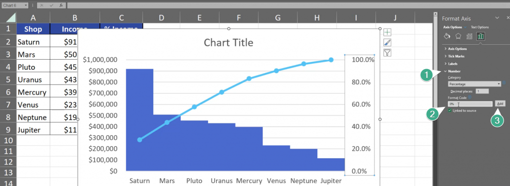
We have to select the axis, press Ctrl + 1, go to Axis Options and write 1 in the Maximum bar, which equals 100%. We also change our Major Units to 0.2 which means that there will be less percent numbers showed on the axis (Fig. 9)
Fig. 9 Less percent numbers
We still don’t need the 0 after dot in our percentages, so let’s go to Numbers and change the Format Code from 0.0% to 0% and click Add (Fig. 10)
Fig. 10 Format Code change
Now, let’s go to the Income Format Axis. Press the axis and Ctrl + 1. Let’s change the Major from 100000 to 200000. This way the chart will show less numbers (Fig. 11)
Fig. 11 Less numbers
What I care about the most right now are data labels for the line. Let’s click once on the line, click on the plus sign and we have Data Labels option. Let’s place them above our line (Fig. 12)
Fig. 12 Data Labels
We still need to set a proper title. Let’s just write Pareto. After implementing the most important changes, the Pareto chart looks like that (Fig. 13)
Do you want to know how to round numbers? Follow me.
Round to nearest multiple MROUND, FLOOR or CEILING functions
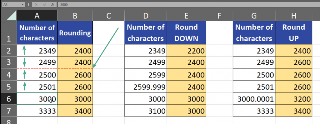
Let’s assume I get paid for correcting text and I don’t want to work with tiny amounts, like individual cents. What may help me is rounding the number of characters checked by me in a given text. When I round it, my income will be rounded as well. Let’s assume that I want to round to the nearest multiple of 200. In standard Excel rounding, when we go to the middle of the number, which in our case is 100, the rounding starts to go up. It means that when we use, e.g. the MROUND function to round the nearest multiple of 200, in the case of 2349 we go up because we passed the threshold of 2300. However, in the case of 2499, we go down. Why? Because we haven’t reached the middle point. But when we reach the middle point, which in this example is exactly 2500, we go up. In order to go up, we only have to reach the middle point, and when we don’t reach this point we go down. It means that it’s even for me and for my customer (Fig. 1)
Fig. 1 Threshold and rounding
Sometimes, there are situations that I always want to round down or always round up. Let’s assume that rounding down will be a little bit nicer to my customer, and rounding up will be nicer for me. How can we do it? In Excel, when we always want to round down, we can use the FLOOR function (Fig. 2)
=FLOOR(D2,200)
Fig. 2 FLOOR function
We have to remember that we are still using the rounding to the nearest multiple of 200. Our rounding goes down even if we passed the halfway. Even, when we are very near and almost reached the point of the multiple, and even if the difference is a very small fraction of an integer, like in 2599.999, we still go down. And when we reach the nearest multiple, which is 3000 in our case, it becomes our base and we will still go to this base until we reach the next base, which is the next multiple of 200 (Fig. 3)
Fig. 3 Rounding down
When we want to always go up, we can use the CEILING function, where we also give it a number and significance, i.e. a multiple, as it was with the FLOOR function (Fig. 4)
=CEILING(G2,200)
Fig. 4 CEILING function
When we pass our next multiple, we always go up. Even if the number passed the nearest multiple by only a small fraction, like 30000.0001, we still go up (Fig. 5)
Fig. 5 Rounding up
Of course, 200 is only an example of a multiple for those functions. We can write there 500, or use even decimal numbers, like 0.5 or 1.5. However, the example above used simple, hole numbers.
Today, we are going to talk about putting two different series into one chart.
Secondary Axis on Excel Chart Temperature and rainfall
If you have two series that differ from each other, e.g. they have different units or one of them is much bigger than the other, then you should use the Secondary Axis on you chart. How can you do it? From Excel 2013 the task is simple as Microsoft inserted the Combo chart. Our example has simple data, so we just have to click on one cell, then go to the Insert tab, where we can find a Combo chart with the Secondary Axis (Fig. 1)
Fig. 1 Combo chart with secondary axis
I can see that not everything is as I wanted, that’s why I’m going to make some changes. I just select the chart and go to the Chart Design tab, where I can find the Change Chart Type option. In the window that appeared, we change the type of each series. The rainfall is on the secondary axis, which is good, however, I prefer the rainfall to be presented as a column chart, and I will put the temperature into a line chart with markers (Fig. 2)
Fig. 2 Column chart and line chart with markers
After pressing OK, we can see a finished chart with two values (Fig. 3)
Fig. 3 A finished chart with two values
But, how can we do it in Excel from before 2013? Let’s insert a simple column chart by going to the Insert tab, then choosing the proper column chart (Fig. 4)
Fig. 4 Column chart
As our values differ much in size, where the rainfall is significantly bigger than the temperature, I would like to have the rainfall series on a secondary axis. I have to select the hole series by clicking once on the series element, then press Ctrl + 1, find the series option, go to Plot Series On, and choose Secondary Axis (Fig. 5)
Fig. 5 Series options
And, just like that we have a different axis for rainfall, and a different axis for temperature. There is still one thing we need to change, which is the type of temperature series, because now one series is behind the other and we don’t know how high some columns are. Let’s click one time on the series and go to the Insert tab, where we can choose a new chart type. Let’s choose the Line with Markers option (Fig. 6)
Fig. 6 Line chart with markers
Just like that, I have a chart with a secondary axis and different chart types. Let’s change the name of the chart into Temperature and rain. The chart is finished (Fig. 7)