Today, we want to learn how to create a chart on which we have unique targets for each month, group, shop, etc.
Target Chart with Unique targets
The most important task for us is to create proper data. When we do it in the right way, the rest will be much simpler. Let’s start with creating a Base series, which will be the foundation of our chart. We have to check if the income is larger than the target. It means that we have to make a logical test with the IF function. If it’s correct, we want the smaller value, which is the target value. In the other case, we want the income (Fig. 1)
=IF(B2>C2,C2,B2)
Fig. 1 IF function for the Base series
And just like that, we have our foundation. Now, we can move on to the next step. If the income is larger than the target, we want to know how much larger it is. We will create it in the Upper column. We start with the IF function again, and we are checking if the income is larger than the target. If so, we want to deduct the target from the income. In the opposite case, we want nothing, i.e. we want our chart to show nothing. It means that we cannot write just an empty text string in the formula in two double quotes. We have to return an error. The simplest way I know is using the NA function (Fig. 2)
Fig. 2 IF function for the Upper series
And just like that, we have our Upper series. The last thing to do is the Lower series. It is very similar to the previous formula, All we need to change is the ‘larger than’ sign into ‘smaller than’ sign, and deduct the income from the target (Fig. 3)
Fig. 3 IF function for the Lower series
Just like that, we have the second series.
Now, when we have a value in one of the Upper cells, we will have an error in the same row in the Lower cell, and vice versa. When our data looks OK, we can move on to inserting a chart. We have to select the Months column, as well and the Base, Upper and Lower series. Then, we go to the Insert tab (1), then to the bar chart, where we select the Stacked Column option (2) (Fig. 4)
Fig. 4 Creating a stacked column
Now, we have all we need. We have our Base. When our income is larger than the target, we have a blue part, and when we didn’t reach the target, we have green. Let’s change the colors, so that the differences are more visible. I also don’t like the horizontal lines, so let’s delete them by selecting them and clicking the Delete key. I will also widen the columns by selecting them and pressing Ctrl + 1. In the Format Data Series window on the right we can change the Gap Width to 70% (Fig. 5)
Fig. 5 Gap Width option
Now, I want to add our target. Since we have only column charts here, we can copy our target column, select the chart and press Ctrl + V. Now, we have our target, however, we don’t want to have another column. We can change it into a line chart with marks. We can do it by right-clicking on the target series in the chart. In the pop-up menu, we have a Change Series Chart Type option (Fig. 6)
Fig. 6 Change Series Chart Type option
In the Change Chart Type window, we can change our target by clicking on proper options (Fig. 7)
Fig. 7 Line with Markers option
However, there is one more option. We can go to the Insert tab, and when the series is selected, we choose a proper chart. The result is the same (Fig. 8)
Fig. 8 Line with Markers option
Now, we have to select our line with markers, then press Ctrl + 1 to open the Format Data Series window. When our line chart is selected, we have to go to the bucket part, and select the No line option in the Line part (Fig. 9)
Fig. 9 No line option
In the Marker part, we can use some built-in markers, like a line. However, when I’m using the line, it’s too thick for me, especially in a bigger size (Fig. 10)
Fig. 10 Bigger size
In such a case, we can do another trick. Let’s go to the Insert tab (1), then the Shape part (2), and select a simple Line (3) (Fig. 11)
Fig. 11 Line option
Now, while holding the Shift key, we can draw a line with our mouse (1), and modify it (2) (Fig. 12)
Fig. 12 Line modification
Now, we can copy the line, then select markers and paste it. I can see that my line isn’t long enough, so i’ll just make it longer, then paste it once again (Fig. 13)
Fig. 13 Longer line
Now, let’s insert data labels. In the Chart Elements window we have to select the Data Labels option. Excel,then will give me data labels for each series (Fig. 14)
Fig. 14 Chart elements window
However, I don’t want data labels for the target series, so I have to select it and just delete it. Now, It’s important that we have data labels for our upper part only when there is an upper part. In places with errors, there won’t be data labels. The same is with lower parts. Errors won’t show anything on the chart. Let’s change lower data label color by going to the Home tab and selecting white (Fig. 15)
Fig. 15 Color change
Let’s add the chart title. Let it be the contend of cell B1. We write = in the formula bar, then click the cell and press Enter (Fig. 16)
=‘E061’!$B$1
Fig. 16 Chart title
There is one more thing. I sometimes don’t want to show the target series in the legend. To remove it, we have to click on the legend, then once more on the target series in the legend, then press Delete (Fig. 17)
Fig. 17 Final chart
Now, I’m happy with my chart with unique target for months, groups, shops, etc.
Today, we want to learn how to insert a bar or a column chart in Excel.
Creating a Column Chart
For a start, we can select a cell in our dataset. We can also select the whole set. Then, we go to the Insert tab and choose a proper chart. I personally like 2 D columns, so I’ll select it (Fig. 1)
Fig. 1 Selecting a 2 D column chart
And just like that, we have our chart. We can modify its size by dragging the borders. When you drag the chart holding the Alt key at the same time, Excel will match the size of the chart to cell borders, which is a nice trick.
Now, that we have our chart, let’s change the way it looks. Let’s go to the Chart Design tab and choose one from the Chart Styles (Fig. 2)
Fig. 2 Selecting a proper chart style
We can also decide what individual chart elements we want to change. If we want to delete horizontal lines, we can just click on them once, and press the Delete button. If we want to have wider columns, we have to click on them, then press Ctrl + 1, which will open the Format Data Series window, where we can change the Gap Width. Let’s change it to 55 %. Now it looks good (Fig. 3)
Fig. 3 Gap Width to 55%
I will also add data labels. Let’s go to the Chart Elements (1) , and choose Inside End Data Labels (2) (Fig. 4)
Fig. 4 Inside End Data Labels
Now, let’s change the font color into white. You can find this option in the Home tab (1) , in the Font area (2) (Fig. 5)
Fig. 5 Font color
And just like that we’ve created a column chart. When we change some values in our dataset, our values in the chart will also change (Fig. 6)
Today, we want to learn how to create a step chart in Excel.
Step chart
This task is really simple. All we have to know is one, simple trick. Our dataset has got two columns. One with dates and one with numbers. Let’s copy the set so that we can leave the original one as it is and paste it next to it. Now, let’s copy the original set once more, but this time without headers and paste it just under the new one. Now, we have to delete two cells using the Shift cells up option. Let’s right-click on the first cell in the first column and choose the Delete option. It will take us to the Delete window, where we have to select the Shift cells up radio button (Fig. 1)
Fig. 1 Shift cells up option
Let’s do the same with cell E10, but this time using the Crtl + - shortcut, which will take us straight to the Delete window (Fig. 2)
Fig. 2 Delete window
After removing those two cells, we have our dataset prepared for the step chart. Now, let’s select one cell in our dataset with dates, then go to the Insert tab (1), then select the Line Chart with Markers option (3) (Fig. 3)
Fig. 3 Line with Markers option
I chose a line with markers to show that almost each date has got two points. It means that there is a straight horizontal or vertical line from one day to another.
From this point on, we can modify our chart if we need to, however our basic step chart is ready (Fig. 4)
Today, we want to learn how to show a hundredth of a second or a milliseconds in Excel.
Milliseconds and Hundredths of a second
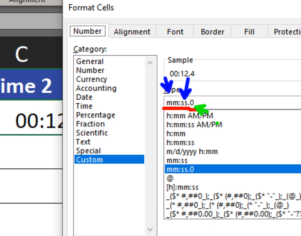
Let’s start by writing our time in a cell. Let’s assume that we want 0 minutes, 12 seconds and 45 milliseconds. Let’s enter it in our cell. We can see that we have two places for minutes and only one digit after it. It’s not a hundredth of a second, but it’s only a starting point. Since we’re working with time, a simple Increase Decimal option wont’ work here, as they’re not real numbers. Let’s press Ctrl + 1. It will take us to the Format Cells window. We are in the Number tab, Custom Category, where the custom format is mm.ss.0. We can see that the decimal part is only one 0 (Fig. 1)
Fig. 1 Time format
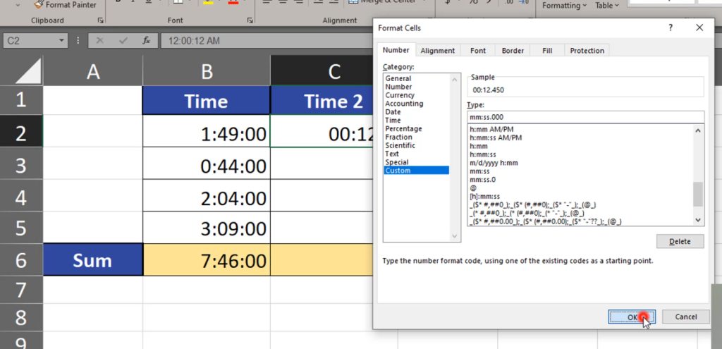
Let’s add two more zeros. Three zeros is the maximum number of decimal places for time (Fig. 2)
Fig. 2 Three zeros
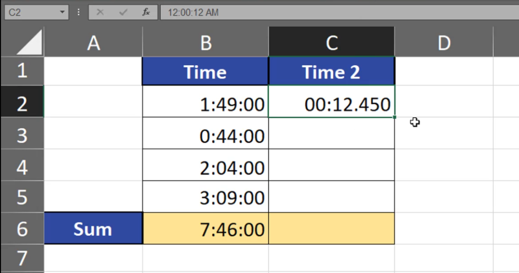
Now, we have more precise time (Fig. 3)
Fig. 3 Precise time
We can do the same with other cells. We can even add hours (Fig. 4)
Fig. 4 Adding hours
However, in our case we don’t need it. Let’s test our setting and write 00:45.670 in the next cell, and 00:00.001 in another one. We can see that Excel is showing the time precisely. Now, let’s add it all up and check if the result is also precise (Fig. 5)
=SUM(C2:C5)
Fig. 5 Summing up
Here we go, the time is precise also in this case.
Today, we want to learn how to add a trendline to a chart.
How to add a trendline to a chart
It’s a really simple task. We just have to select our chart, then press the green plus sign (Chart Elements) and go to the Trendline option. We can see that there are many types of trendlines, starting from Linear. Let’s use it (Fig. 1)
Fig. 1 Linear option
We can see that the trendline is of the same color as our columns, which we don’t want. Let’s click on our trendline, then press Ctrl + 1. In the Format Tredline window, we can see that we can modify it in many ways. Let’s click on the bucket icon, and change its color (Fig. 2
Fig. 2 Color modification
Now, I can see my trendline on the columns. When we select our trendline once more and press Ctrl + 1 again, we can even add an equation and some statistical information (Fig. 3)
Fig. 3 Statistical information
If we don’t want it, we can press Delete. It’s important that the trendline doesn’t work with all chart types, only the most common ones, like a column chart or a line chart (Fig. 4)