Why do politicians lie to us when talking about average wages? Let’s ask Excel.
Median vs Average wages
Let’s calculate some average. The AVERAGE function is a simple function that sums up values from all cells in a range and divides it by the number of cells with values (Fig. 1).
=AVERAGE(D2:D12)
Fig. 1 AVERAGE function
In our example, the average is $2,900. It means that 8 people earn less, which gives us around 80% of all people. It’s important that one person at the bottom earns much more than the rest and affects our average more than other people (Fig. 2).
Fig. 2 Average wages
If we want to talk more precisely about the distribution of those wages, we can use the MEDIAN function which returns the value in the middle (Fig. 3).
=MEDIAN (D2:D12)
Fig. 3 MEDIAN function
Since our values are sorted, we can clearly see the middle value, which is $2,000. We can see that 50% of people earn this value or less and 50% of people earn this value or more (Fig. 4).
Fig. 4 Median value
If we have an even number of values and there are two middle values, the MEDIAN function calculates the average of those two values near the middle line (Fig. 5).
=MEDIAN(G2:G11)
Fig. 5 MEDIAN function with even number of cells
We can see that it calculated the middle value (Fig. 6).
Fig. 6 Median value
If we add one zero to cell D12 which belongs only to one person, we can see that the average hit $11,900. It means that only one person earns more that the average. On the other hand, the median value stayed the same. It’s very important to know this difference (Fig. 7).
Fig. 7 Higher average
I also want to add one column with the RAND function (Fig. 8).
=RAND()
Fig. 8 RAND function
I want to show you that we don’t have to have our data sorted to use the MEDIAN function (Fig. 9).
We can count the number of spaces between words. Let’s have a look at our first example. In cell A2, we have spaces between words and at the end of each line, so the case is simple. We can use the LEN function here that counts the length of text (Fig. 1).
=LEN(A2)
Fig. 1 LEN function
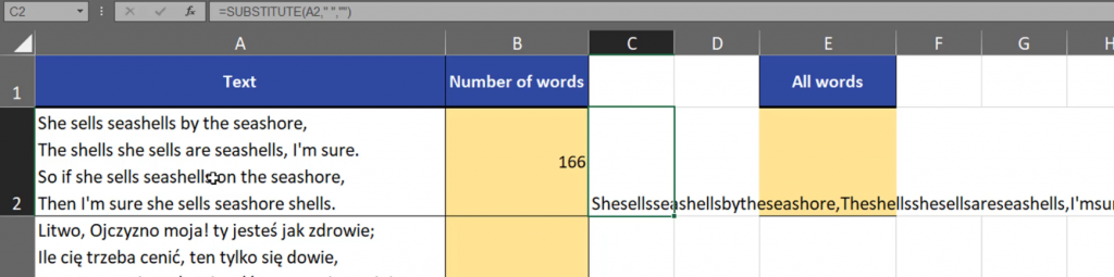
Now, that we have the number of signs, we can remove spaces. We can use the SUBSTITUTE function here. This function will change the old text, which in our case is a space into new text. And since we want to remove spaces, our new text will be an empty text string written in double quotes (Fig. 2).
=SUBSTITUTE(A2,” “,“”)
Fig. 2 SUBSTITUTE function
We can see that the function removed all spaces from our text (Fig. 3).
Fig. 3 No spaces
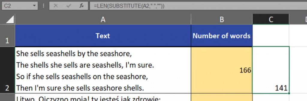
Now, we can count the length of the text without spaces using the LEN function (Fig.4).
=LEN(SUBSTITUTE(A2,” “,“”)
Fig. 4 Counting the text length
Now we know the length (Fig. 5).
Fig. 5 Text length
Since we know how many spaces there are, we can use the formula to count the words. We just have to subtract this formula from the previous one (Fig. 6).
=LEN(A2)-LEN(SUBSTITUTE(A2,” “,“”))
Fig. 6 Subtracting formulas
And we have the number of spaces (Fig. 7).
Fig. 7 Number of spaces
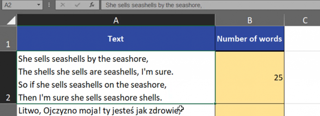
We still have to remember that to count the number of words, we have to add 1 because there is only one space between two words (Fig. 8).
=LEN(A2)-LEN(SUBSTITUTE(A2,” “,“”))+1
Fig. 8 One space between two words
Now we know the number of words in each cell.
Fig. 9 Number of words
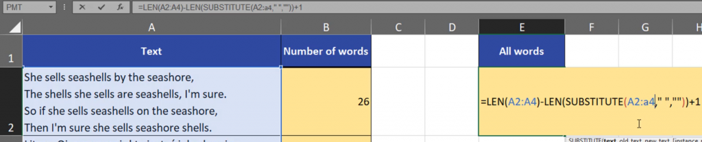
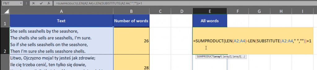
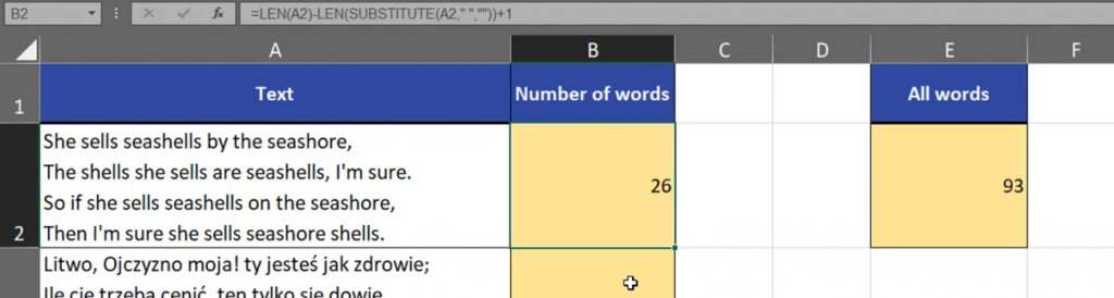
If we want to count words from all cells, we can use almost the same formula. The only thing we have to change is the range which now will be from A2 to A4 (Fig. 10).
=LEN(A2:A4)-LEN(SUBSTITUTE(A2:A4,” “,“”))+1
Fig. 10 Adding a new range
In Dynamic Array Excel, the results will be spilled, however we can sum the up (Fig. 11).
Fig. 11 Split results
In the previous version of Excel we can use the the SUMPRODUCT function (Fig. 12).
Count cells with text, COUNTIF function and wildcards
For me, the simplest solution is using the COUNTIF function and wildcards. We have an asterisk that represents any text string, even an empty one. We also have a question mark that represents just one single sign (Fig. 1).
Fig. 1 Wildcards
Let’s start with counting all cells with text. First, we have to select a proper range and press the F4 key to lock it. Then, we have to write an asterisk in double quotes so that it counts any text string, even an empty one (Fig. 2).
=COUNTIF($B$2:$B$11,”*”)
Fig. 2 Proper range and an asterisk
And just like that we have 4 cells with text. In cell B6 I have pasted an empty text string and even if we see nothing, Excel counts it as a cell with an empty text string. But, what can we do if we don’t want to count empty text strings? We can copy our formula and add a question mark next to the asterisk. It doesn’t matter if it’s before or after the sign (Fig. 4).
=COUNTIF($B$2:$B$11,”?*”)
Fig. 4 Formula modification
This way we counted all cells that have at least one sign (Fig. 5).
Fig. 5 Results
If we want to count all not empty cells, we can change our criteria to the <> signs (Fig. 6).
=COUNTIF($B$2:$B$11,”<>”)
Fig. 6 Adding <> signs
However, the simplest solution in most cases would be using the COUNTA function, where we don’t have to worry about any criteria (Fig. 7).
If we want to show our data trend, we can use line charts, however they are usually large. If we want something simple and small, like a chart in a cell, we can use Sparklines.
Sparklines Chart in cell
All we have to do is to select one empty cell, then go to the Insert tab, then go to Sparklines and select the Line Sparkline option. What we will get is a Create Sparkline window, where we have to select a a proper range and check if location is good.(Fig. 1).
Fig. 1 Creating a sparkline
After pressing OK and dragging it down, we have trends for other countries (Fig. 2).
Fig. 2 Ready trends
If we want to add some markers, we have to open the Marker Color bar and choose proper options (Fig. 3).
Fig. 3 Adding markers
After adding markers, sparlines look as follows. If we want to make them bigger, we have two options. We can simply enlarge the cells or we can merge a few cells using the Merge & Center option from the Insert tab (Fig. 4).
If you have a small dataset, a pie chart is one of the best ways to show it. How can we insert a pie chart?
Pie Chart and Percentage % Data Labels | Excel Tips #29
Let’s start with a single cell, then go to the Insert tab, then 2D Pie command. And there we have it (Fig. 1).
Fig. 1 A new pie chart
We have to remember that a pie chart will include the whole text before numbers, which, in our case are cities and countries. (Fig. 2).
Fig. 2 Whole text before numbers
We don’t want to see countries because there will be too many names. Let’s delete our chart and select proper ranges, i.e. the City and the Number of residents columns. Then, select the Insert tab, and 2D Pie command (Fig. 3).
Fig. 3 A pie chart based on two columns
The best part of pie charts are Data Labels. I personally like the Data Callout option best. We have the category name and percentage there (Fig. 4).
Fig. 4 Data Callout option
If you have different kind of data, you can change the content of data labels. We just have to click once on the pie chart and press Ctrl + 1 keyboard combination. We will see a table called Format Data Labels on the right, where we can select and deselect what we wan to see in the labels (Fig. 5).
Fig. 5 Format Data Labels
Sometimes, we have to sort our data from largest to smallest or from smallest to largest (Fig. 6).
Fig. 6 Data sorting
Remember that a pie chart is recommended when you don’t have much information to show. An optimal number is around five pieces of information. In case you have more, a pie chart will be less readable.